
A visitor should not need patience, detective skills, or inside knowledge to understand what you are offering.
People arrive distracted. They may be holding a phone, switching between tabs, checking an email between meetings, or deciding whether your message deserves another few seconds.
If the value is buried, they rarely dig for it. They simply leave with the impression that the offer was not for them.
Today, you will make one real asset easier to understand. And by the end of this lesson, you will have a clear opening message that tells the right person what they are looking at, why it matters, and what to do next.
Today's big idea
Clarity allows people to recognize value quickly.
Your visitor is silently trying to answer four questions:
The longer those answers remain uncertain, the more effort the experience demands. That effort creates hesitation before the visitor has even considered the offer itself.
Clear marketing does not need to explain everything at once. It needs to reveal the right information in the right order, beginning with what the person must understand before continuing.
Why this is important
Confusion rarely announces itself. Visitors do not usually send a polite message explaining that the headline was vague, the page hierarchy felt scattered, or the call to action appeared before they understood the offer.
They pause.
They scroll.
They click the wrong thing.
They postpone the decision.
Then they disappear.
This makes confusion easy to misdiagnose. A business may assume the price is too high, the audience is wrong, or the offer needs another bonus when the visitor simply could not determine what was being sold and why it mattered.
Clarity gives every other conversion element a fair chance.
Proof becomes more persuasive when people know which claim it supports.
A call to action becomes more meaningful when they understand what happens after the click.
A strong offer becomes more attractive when they can see the result it is designed to produce.
Clarity begins with the opening
The opening of an asset carries a heavy responsibility. On a landing page, it may be the area visible before scrolling. In an email, it is the subject line, preview, and first few sentences. In a video, it is the opening moments. In an advertisement or social post, it is the first line and visual.
The opening does not need to close the sale. It needs to earn the next moment of attention by creating useful understanding.
A strong opening usually establishes three things quickly: the subject or offer, the relevant person or situation, and the meaningful result or reason to continue.
Compare “A Smarter Path Forward” with “Create Your First Client Welcome Sequence in One Afternoon.” The first could describe consulting, software, financial planning, or a hiking trail. The second gives the reader something concrete to understand.
Cleverness can add personality after the meaning is secure. When cleverness replaces meaning, the visitor is forced to solve a riddle before receiving any value.
Name the thing before decorating it
Businesses often avoid simple category language because it feels ordinary. They call a course an “accelerator,” a newsletter an “intelligence briefing,” a consultation a “breakthrough session,” or a basic feature a branded name nobody outside the company recognizes.
Distinctive language can help a brand become memorable, but unfamiliar terms need context.
“The ClientFlow Accelerator” means more when it is followed by “a six-week implementation program for independent consultants.” The branded name provides personality. The plain-language description provides orientation.
If the visitor must scroll, watch a video, open an FAQ, or search the site to discover what the product actually is, the message is asking for trust before it has earned comprehension.
Make the value concrete
Vague benefits sound safe because they can apply to almost anyone. They also give the mind very little to hold onto.
Words such as “better,” “easier,” “powerful,” “innovative,” and “next-level” are not automatically bad. They become weak when the message never explains what improves, what becomes easier, or what the person will be able to do.
“Grow your business faster” is broad. “Respond to every new lead within five minutes” creates a visible change. “Unlock your potential” is abstract. “Finish and publish your first portfolio page” gives the reader a destination.
Specificity does not require exaggerated promises or a pile of numbers. It requires enough detail for the person to picture the progress being offered.
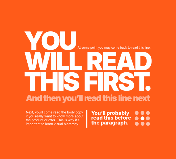
Use visual hierarchy to guide understanding
Clarity is carried by design as well as words. Take a look at this picture...
Design for the small screen and the quick scan
ONE clear next step
Examples across different assets
Advertisement
Clearer: “Turn one customer interview into a week of social content.” The second version identifies a useful outcome and gives the right person a reason to pay attention.
Clearer opening: “Your new-member checklist is ready. Start with these three steps.” Curiosity can help earn an open, but the message itself should quickly deliver orientation.
Sales page
Clearer: The product category, intended customer, primary result, short explanation, and a button that names the action.
Video
Clearer: Establish the problem, promised value, and reason to keep watching in the opening moments, then introduce the presenter where it supports credibility.
Onboarding screen
Clearer: One welcome message, one recommended first action, and a short explanation of why that action matters.
Common mistakes
Your 10-minute win
Build a four-part clarity block
Return to the asset and conversion proposition you used on Days 1 and 2. Focus only on the opening message. Do not rewrite the entire asset.
Create four short lines that answer the visitor’s immediate questions:
Line 1: Name what this is in plain language. Add the branded name only if it helps.
Line 2: State the primary result or progress the person can achieve.
Line 3: Explain who it is for and how it helps in one short supporting sentence.
Line 4: State the single next action in words the person can understand.
Use this simple structure:
[Plain-language category or offer]
[Clear headline describing the desired result]
[Short explanation of who it helps and how]
[Specific next action]
Example:
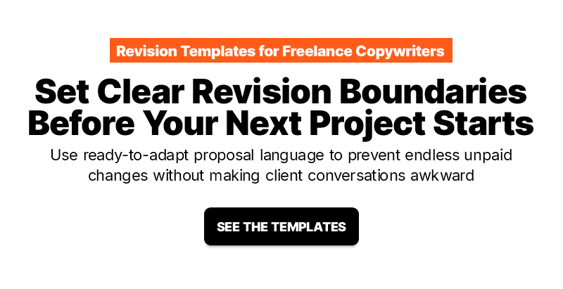
Now read the four lines without any other page content around them. A first-time visitor should be able to identify the offer, the value, the intended person, and the next step.
You are allowed to sound interesting, warm, bold, or distinctive. Just make sure the personality adds flavor to a message the visitor can already understand.
Progress check
You have completed Day 3 when your four-line clarity block makes these answers obvious:
Place the new block beside the current opening of your asset. Even if you do not replace the original today, you now have a clearer alternative and a practical standard for judging the message.
What to notice
Notice where the current asset expects people to fill in missing information. Look for branded terms without explanation, headlines that could belong to any company, buttons that do not describe the next step, and important value hidden below supporting detail.
Also view the opening on a phone. Pay attention to the order in which the headline, image, explanation, and call to action appear. The message should remain understandable when the screen becomes narrow.
Your takeaway today
People can only value an offer after they understand what it is, why it matters, and what to do next.
Up next...
A clear next step can still feel difficult, risky, or irritating to complete. Day 4 will show you how unnecessary fields, confusing instructions, broken experiences, mobile problems, surprise costs, and other forms of friction stop people who were ready to continue.